.svg)
October 11, 2026
30 project colors, built for every eye
.png)
Part of our 31 Customer Improvements series, where we ship one feature our customers asked for every day this month.
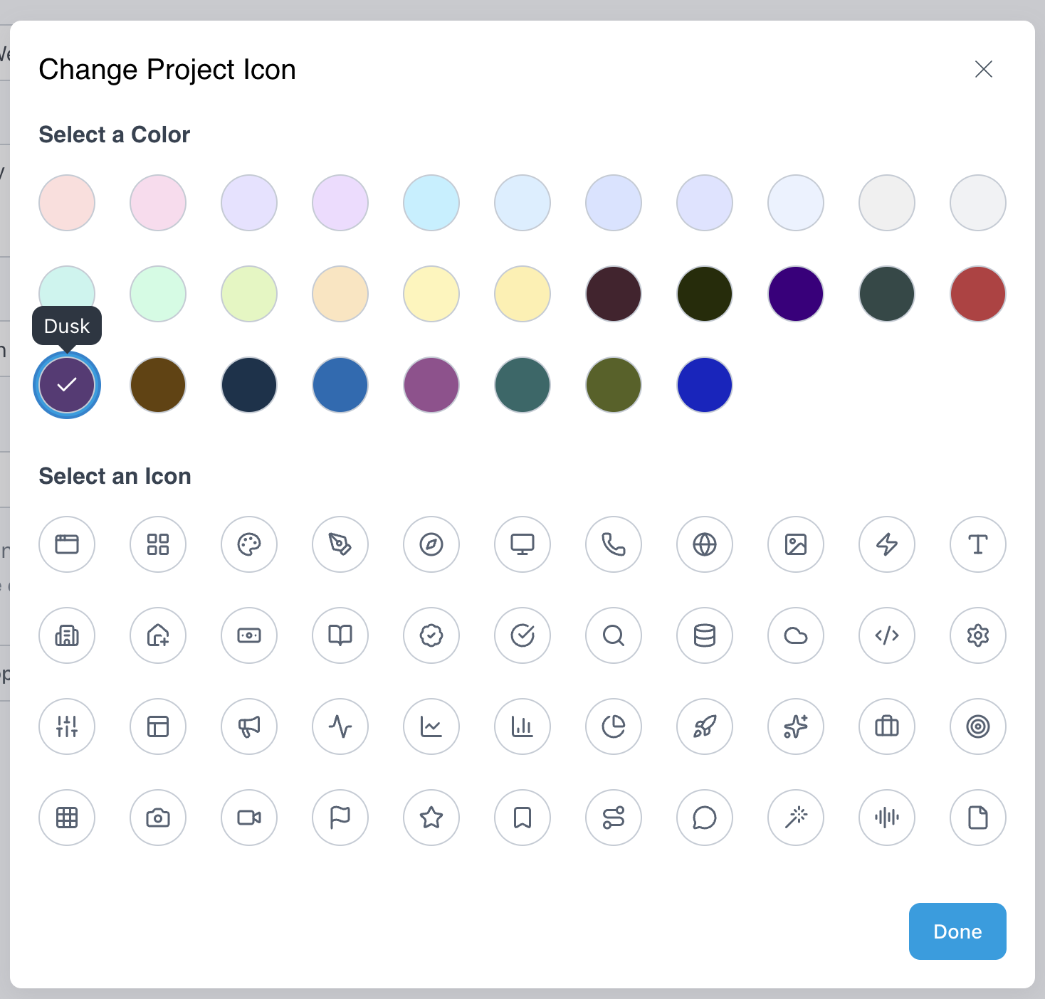
Project icons now come in 30 colors, up from 17. The 13 new colors are deep, rich shades, each with a white icon. We chose every one so it stays easy to tell apart for people with color blindness, too.
Why more colors
A project’s icon is the fastest way to spot it on your dashboard, in task lists, and in the sidebar. With only 17 colors, a workspace full of client work ran out of distinct options quickly, and many teams ended up with several projects in near-identical shades.
Thirty colors give you room for a system that sticks: one color per client, per service line, or per stage of your process. When colors are distinct, your team stops reading names and starts recognizing projects at a glance.
Designed for color blindness
Roughly 1 in 12 men and 1 in 200 women have some form of color blindness, so on most teams, someone sees your palette differently than you do. More colors don’t help if half of them look the same to that person.
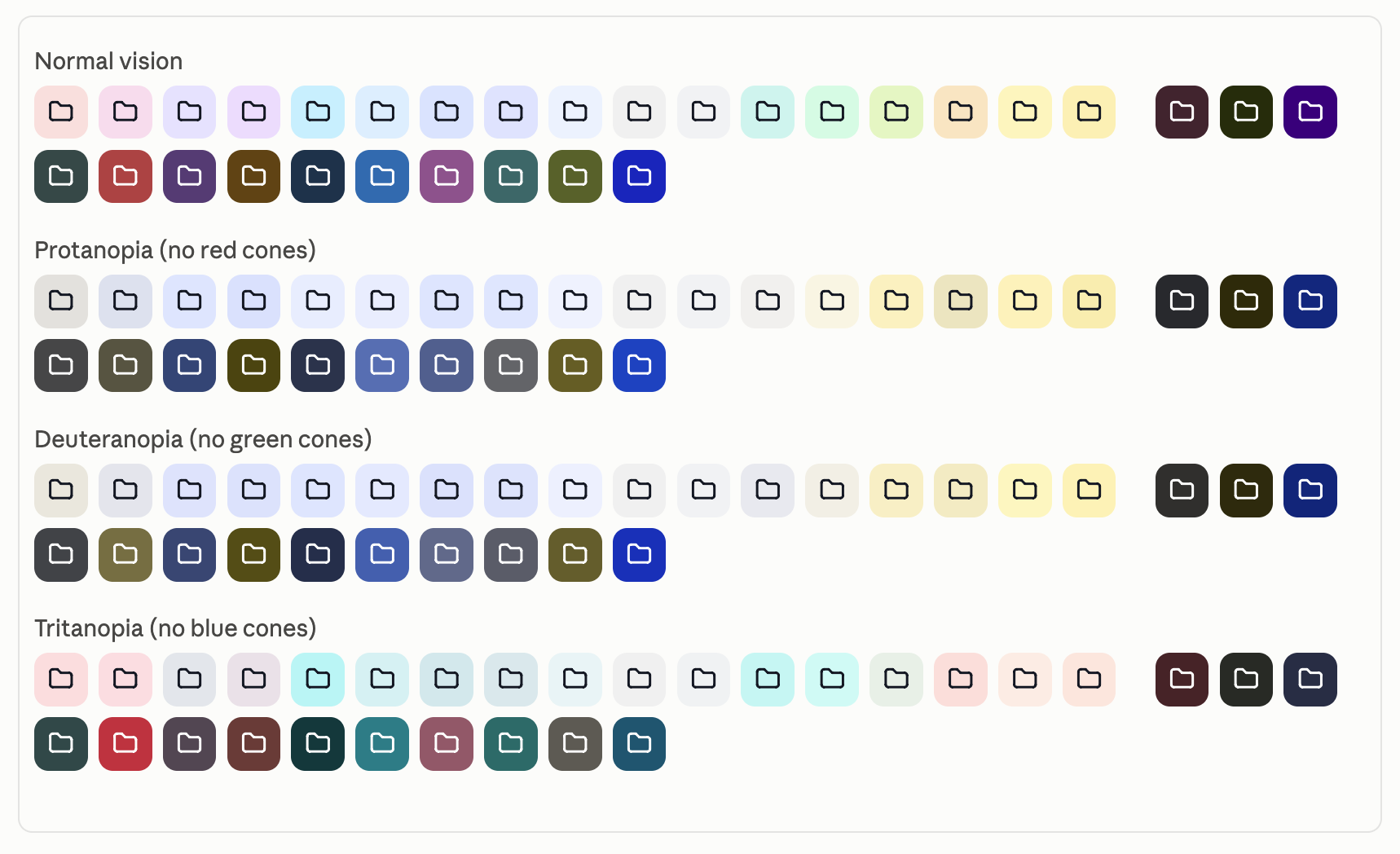
Our original 17 colors are soft pastels that differ mainly in hue, like pink versus lilac or sky versus mint. Hue is exactly what color blindness takes away. So instead of adding more pastels, we added colors that differ in a way everyone can see: lightness. Every new color is deep, and every original color is light, so no new color can be mistaken for an original one, whatever your color vision.
We didn’t just eyeball it and guess. For each candidate color, we simulated how it looks with the three main types of color blindness: protanopia (missing red cones), deuteranopia (missing green cones), and tritanopia (missing blue cones). Then we measured the perceptual distance between that color and every other color in the palette. A color made the cut only if it stayed clearly distinct from all 29 others, under normal vision and under each simulation.
Icons you can always read
The icon on top of each color matters as much as the color itself. Light colors keep a dark icon, deep colors get a white one, and LaunchBay picks the right one automatically.
Every combination has a contrast ratio of at least 4.5:1 between the icon and its background. That meets the WCAG AA standard for text and is well above the 3:1 minimum for icons. The light colors go further, at 14:1 or more.
A friendlier color picker
We also made the picker itself work without relying on color alone:
- Every color has a name. Hover over a swatch to see it, so “use Marine for enterprise clients” is something your team can actually say.
- A checkmark marks your selection, not just a colored ring.
- Screen readers announce each color by name and say which one is selected.
It’s part of a broader accessibility push, along with the screen-reader labels we added in our simpler client portal update.
Try it
There’s nothing to set up, and your existing projects keep the colors they have today. To pick a new one:
- Open a project and go to Settings.
- Click Change Project Icon.
- Choose from all 30 colors, then click Done.
If you set an icon on a project template, every new project created from it picks it up automatically. That makes templates the easiest way to roll out a color system across your client management workflow.